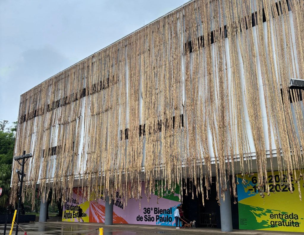
The 36th Bienal de São Paulo has just come to an end so I thought I would share my highlights from the latest edition of the world’s second oldest art biennial.
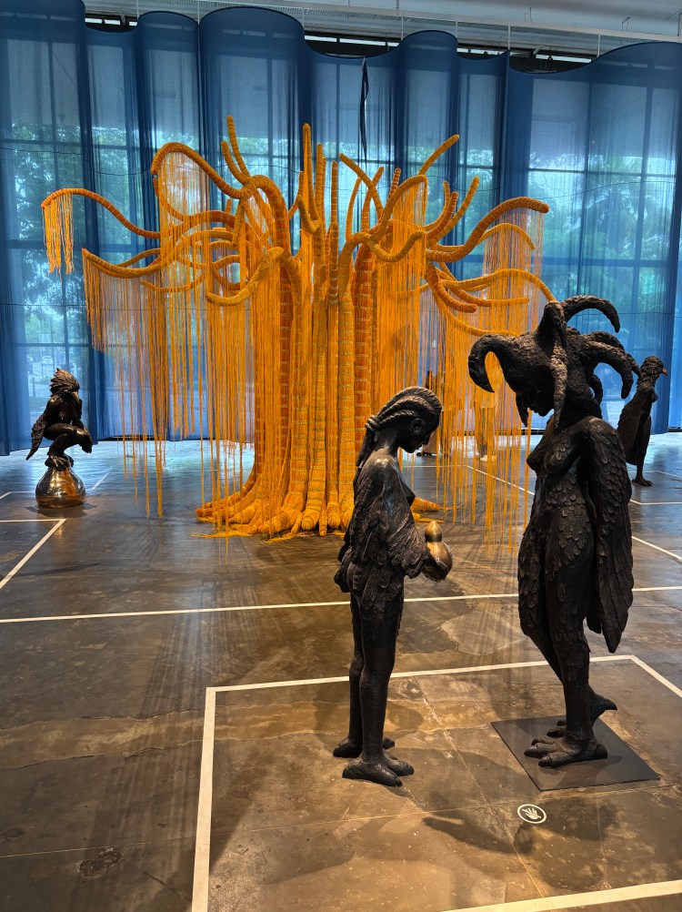
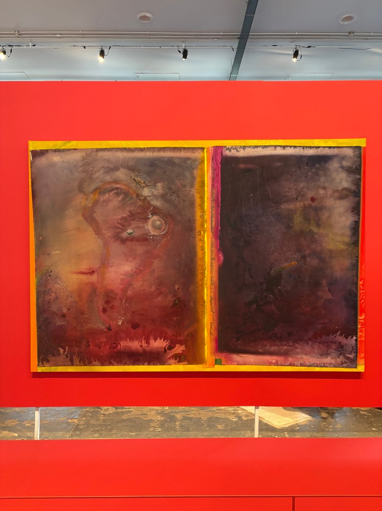
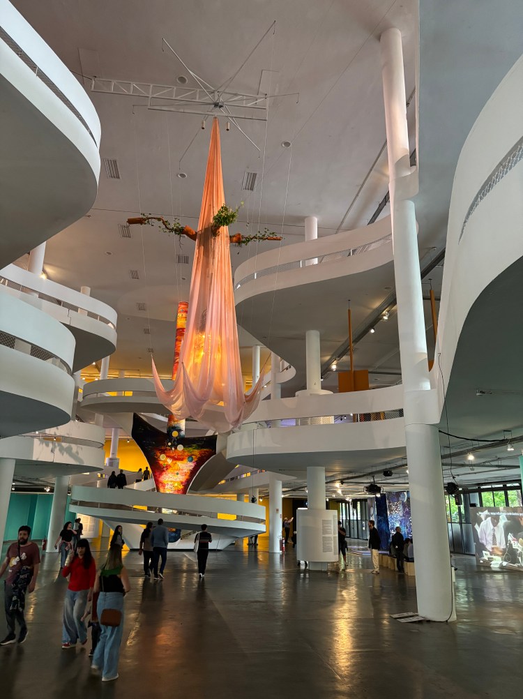
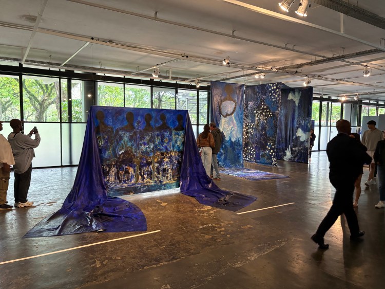
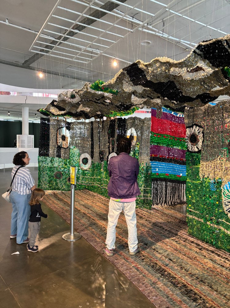
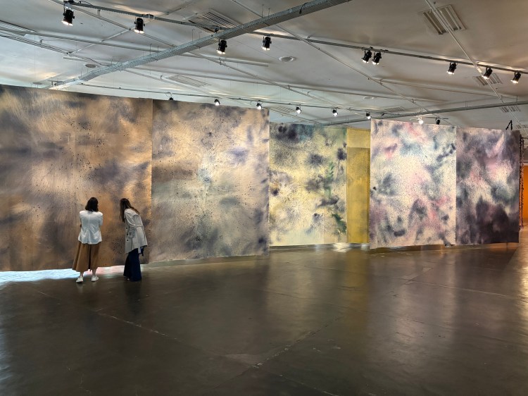
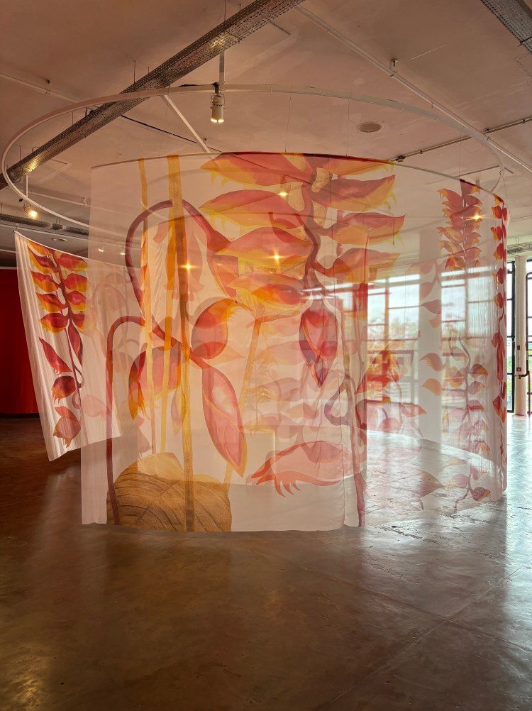
The Bienal de São Paulo is housed in the Ciccillo Matarazzo Pavilion, designed by renowned architect Oscar Niemeyer, in the idyllic Ibirapuera Park in São Paulo. This edition was titled ‘Not All Travellers Walk Roads – Of Humanity as Practice’ and it was packed full of an array of contemporary art over three floors. I felt that the works in the show were thematically disconnected from each other and, although the exhibition was divided into six thematic chapters, it was not easy to see how all of the works were related to them. It seemed a bit random but I loved the variety and quantity of works on display and the architectural design which allowed an open, free flowing experience of space and art. I also had a sense that art suspended from above, painting on different fabrics and fabric sculptures were trending and also very nice.
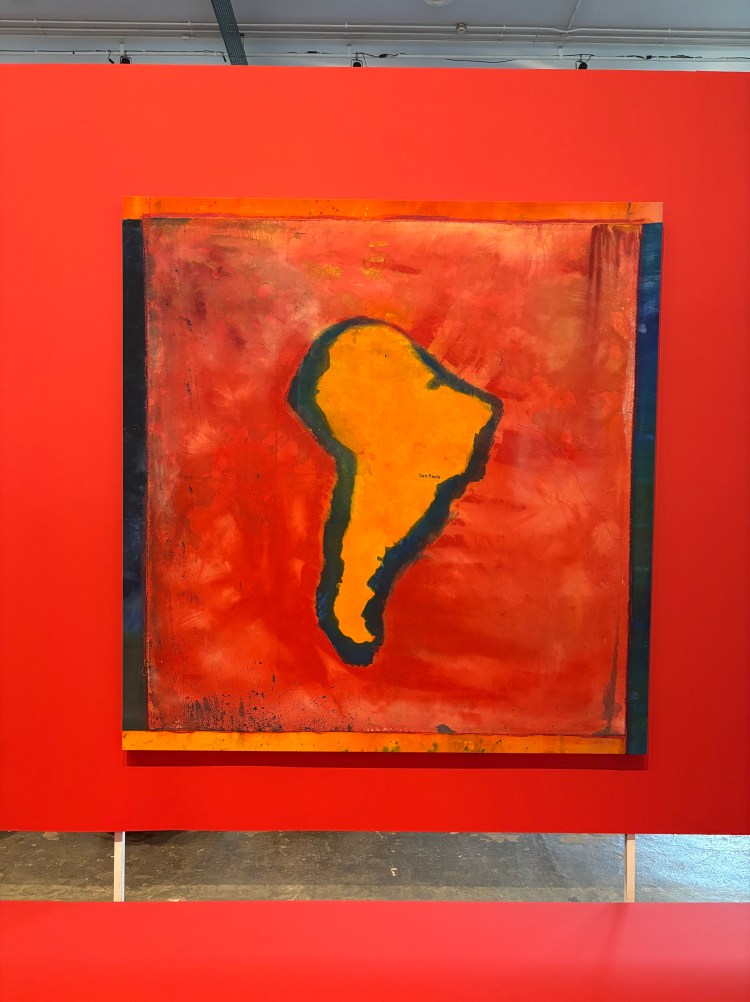
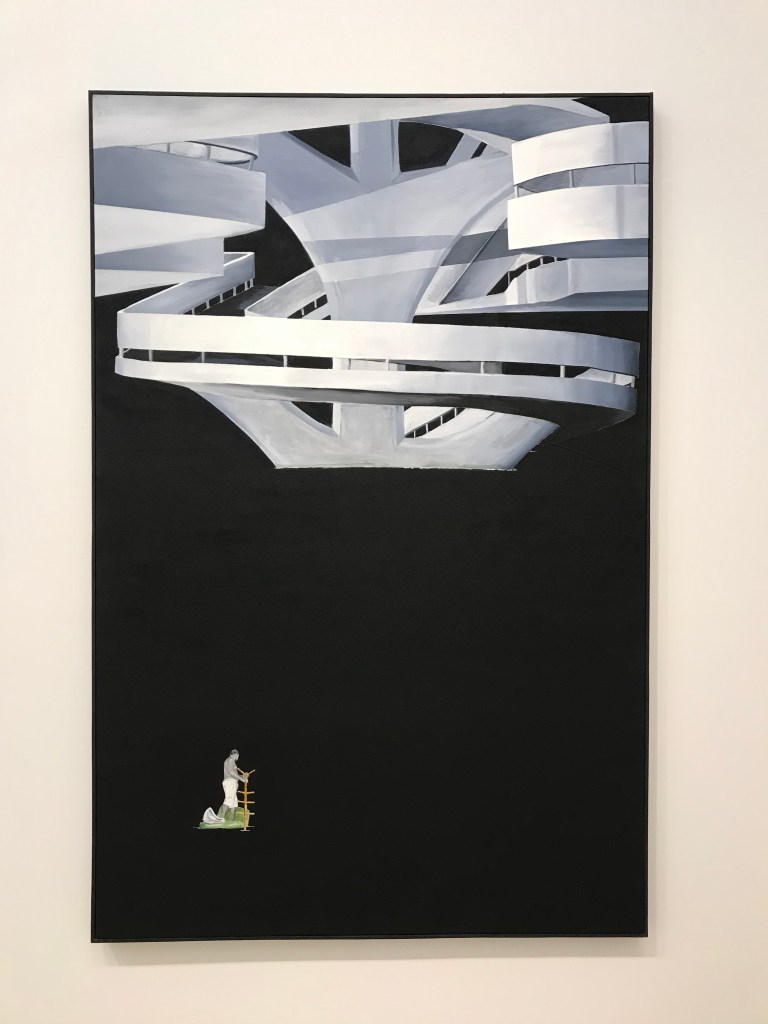
‘O Estrangeiro’ is a painting by Brazilian artist Sidney Amaral. The work caught me by surprise. The flat, black, minimalist style of the painting stood out in striking contrast with the brightly painted gallery containing a huge collection of colourful paintings and art objects. The title of the work translates as ‘The Stranger’ and the work depicts a white, modern architectural form which dominates the upper third of the picture. It is probably a section of the Sao Paulo Bienal’s Ciccillo Matarazzo Pavilion. The modernist building is emphasized by the flatness and the smooth handling of paint. There are no visible brush marks. A void of flat, black paint covers the rest of the painting except for the small figure of a man in the lower left-hand corner. The man is paddling towards the building on a make shift raft. He resembles the artist himself and he paddles shirtless while using a wooden coat rack with Marcel Duchamp’s Urinal sat on the back of a green sofa or mattress. It is an absurd scene but I was drawn to the solitude of the man and the way he seems to be focused on moving forward while appearing to be stuck and isolated in an empty void. He is the stranger.
The painting creates a dramatic juxtaposition between the figure of the paddling man and the modernist building. I realised this was used for more than a visual motif. The void between them acts as a powerful visual metaphor for the perceived and real distance between the contemporary art establishment and the artist himself. The grand, white, modern architecture symbolizes the elitism of the art establishment and the paddling man represents the artist and all the creatives who are trying to enter the art sector. They highlight the hopelessness of the paddling man’s journey and his inevitable failure. It is a powerful critique of the arts sector and a statement about creative struggle and institutional corruption. As the viewer we can only watch the paddling man desperately try to reach the building as he slowly sinks. Even the urinal, a symbol for art history or art education, cannot help. It’s weighing him down and he’s not going to make it. We can only watch. We are also helpless. We are the stranger.
The painting’s message struck a nerve as so many creatives struggle to be part of a sector known to be riddled with racism, elitism and prejudice. ‘O Estrangeiro’ delivers this powerful critique with a cool, smooth handling of paint and satire. It is bold and poignant. The work was included in a recent exhibition exploring representation and identity in Brazilian society held in the Galeria Lago of the Inhotim Institute, Brazil.
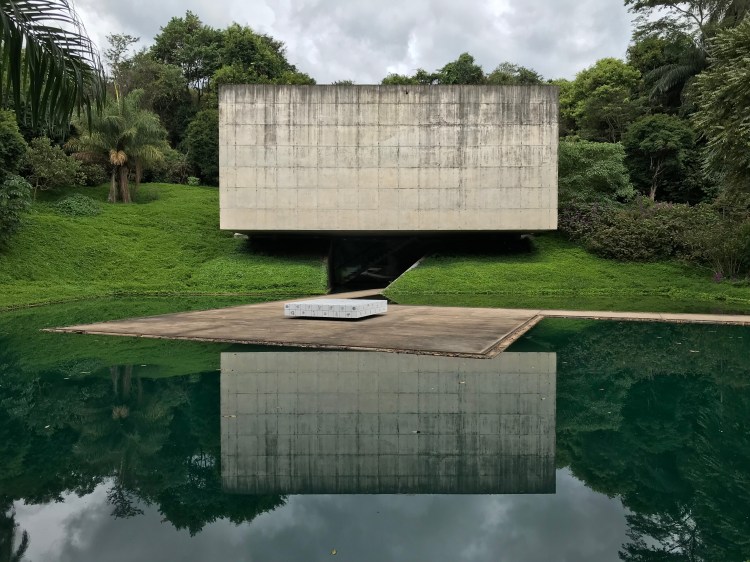
View of the exterior of an art pavilion in the Inhotim grounds
I was lucky enough to visit the Inhotim Institute earlier this year and I found it to be simply one of the most stunning settings that I have ever experienced contemporary art in. It is something like a combination of a botanical garden and sculpture park combined into one giant outdoor art centre. Inhotim has over 345 acres of land which includes some of the most impressive works of contemporary art and collections of plant life from across the world. The institute was founded by Bernardo Paz who was a mining magnate. He started to buy up tracks of land in the area to protect them from property developers and he subsequently transformed the area into what is now a protected natural heritage site. Arriving by coach takes around an hour and a half from Belo Horizonte and takes in spectacular views of the Atlantic Rainforest including the lush landscape from the mountain roads. I was excited to see a wild toucan flying overhead as I arrived at the entrance. After entering, visitors are guided by paths which take you through different zonal areas of the park. Inhotim promotes a holistic experience in which to enjoy both art and nature and you can walk through at your own pace but you can also jump aboard chauffeured golf buggies which take you from zone to zone. Each zone has a lot to see and they include pavilions, galleries, themed gardens, plant life and outdoor artwork.
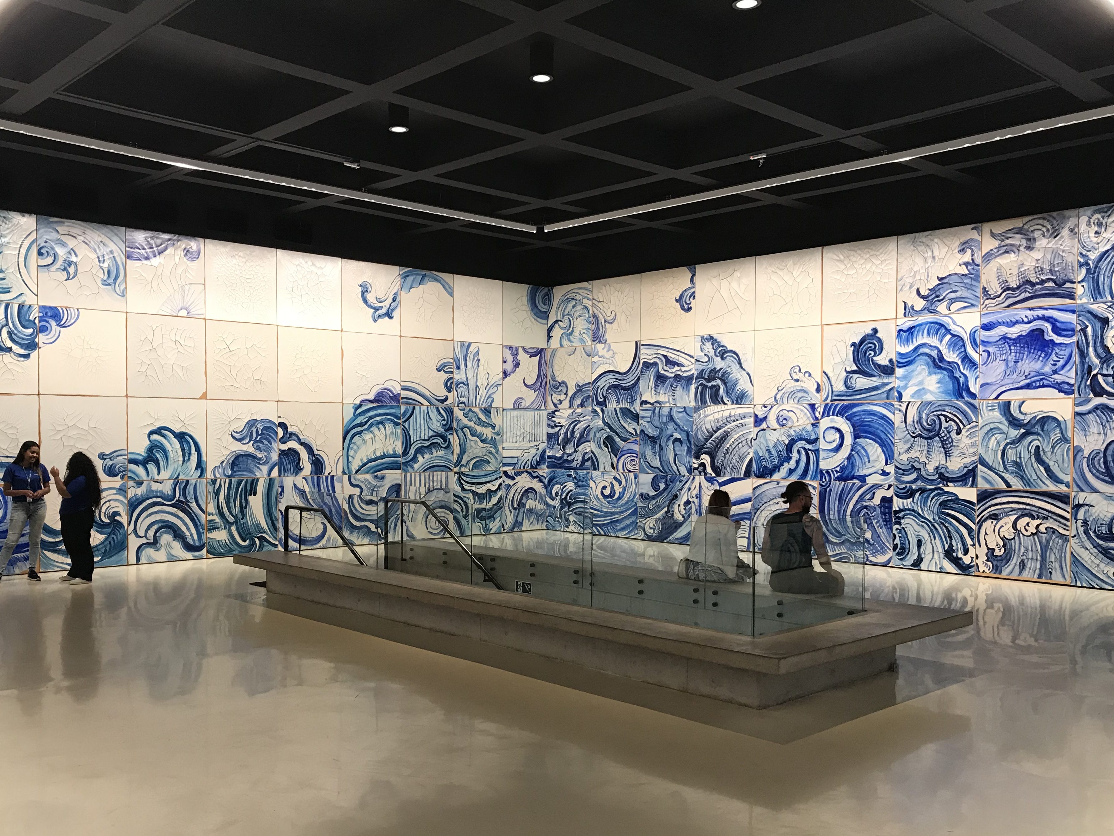
Housing the work of artist Adriana Varejão including the installation; ‘Celacanto Provoca Maremoto, 2004-08’, which was made in situ and reconfigures a panel of oversized Portuguese style tiles or azulejos.
Having fun in Galeria Cosmococa
Galeria Cosmococa
This gallery is the play area of Inhotim. It includes interactive installations with balloons, soft balls, hammocks and mattresses. The works were created by Brazilian artists Hélio Oiticica and Neville D’Almeida and highlight the importance of experimentation and play in contemporary art.
A gigantic installation of steel beams which were dropped, by Burden and his team, from the height of a crane into a pool of wet concrete. Now permanently set in place the work encapsulates an act of randomness on a grand scale. It sort of looks like the ‘pick-up sticks’ game. The closer we get the better the installation frames the landscape and the red rust of the beams contrasts with the lush green of the surrounding foliage beautifully.
Inhotim’s largest gallery houses the work of Brazilian artist Tunga. His work explores themes including the body, science and alchemy. The gallery is full of mixed media, sculptural installations which include models of skeletons, bones, skulls and scientific equipment which are symbolic in the artist’s work. They certainly gave the exhibition a macabre feeling.
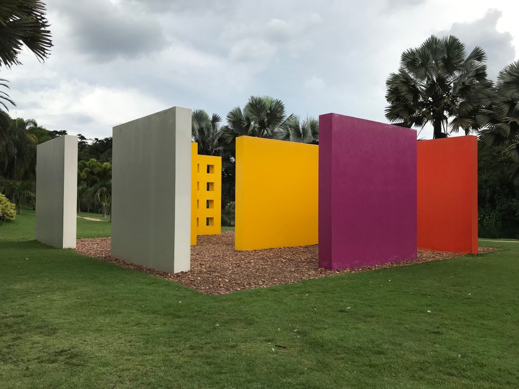
This work is a beacon of colour. Magic Square is made up of nine separate painted concrete quadrangles arranged around a pebble covered floor. The installation invites viewers to enter and explore the internal spaces and brightly coloured walls. Each internal area creates a different feeling and produces a new perspective in the viewer. The work encourages engagement and an interaction between artwork and viewer and art and life.
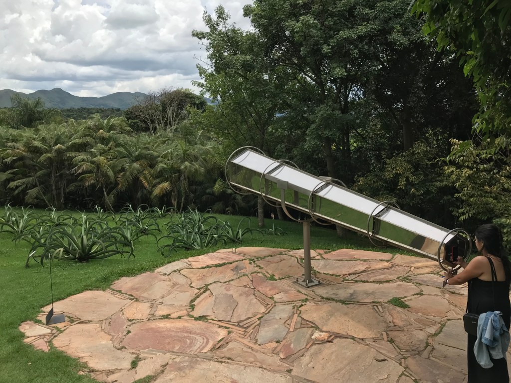
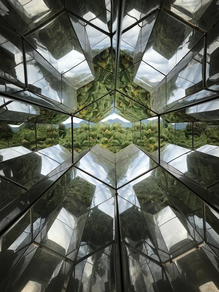
Viewing Machine won’t help you to see distant galaxies but it does give you a kaleidoscopic experience of the stunning surrounding landscape. This playful work alters our vision and transforms the landscape into dazzling geometric shapes. It also gives us a dramatic sense of distance and awareness of the incredible scenery including an impressive mountain range in the distance.
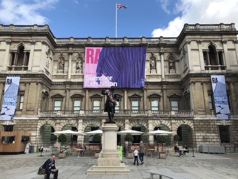
It’s been a while since I visited the Summer Exhibition at the RA. I used to go regularly but started to feel that it was getting samey and repetitive. The massive galleries were always packed, from floor to ceiling, with artworks made in conventional mediums, styles and subject matters. It was impossible to register so many artworks and the show just became one big blur of conventional fine art. Landscape, portrait, still life and a bit of abstract painting always dominated the format of the displays. Photorealism was the pinnacle of the exhibition. It seemed to have been chosen as the artistically aspirational style of choice and visitors loved it. Don’t get me wrong, it is impressive to view an artwork with the level of skill to be able to imitate a photograph but it soon became a gimmick which the Summer Exhibition used to peddle for years. It became dull and turgid. Bogged down in institutional tradition and established hierarchical tastes it seemed like that approach would never shift or reflect contemporary art practice adequately. It felt like nothing would every change.
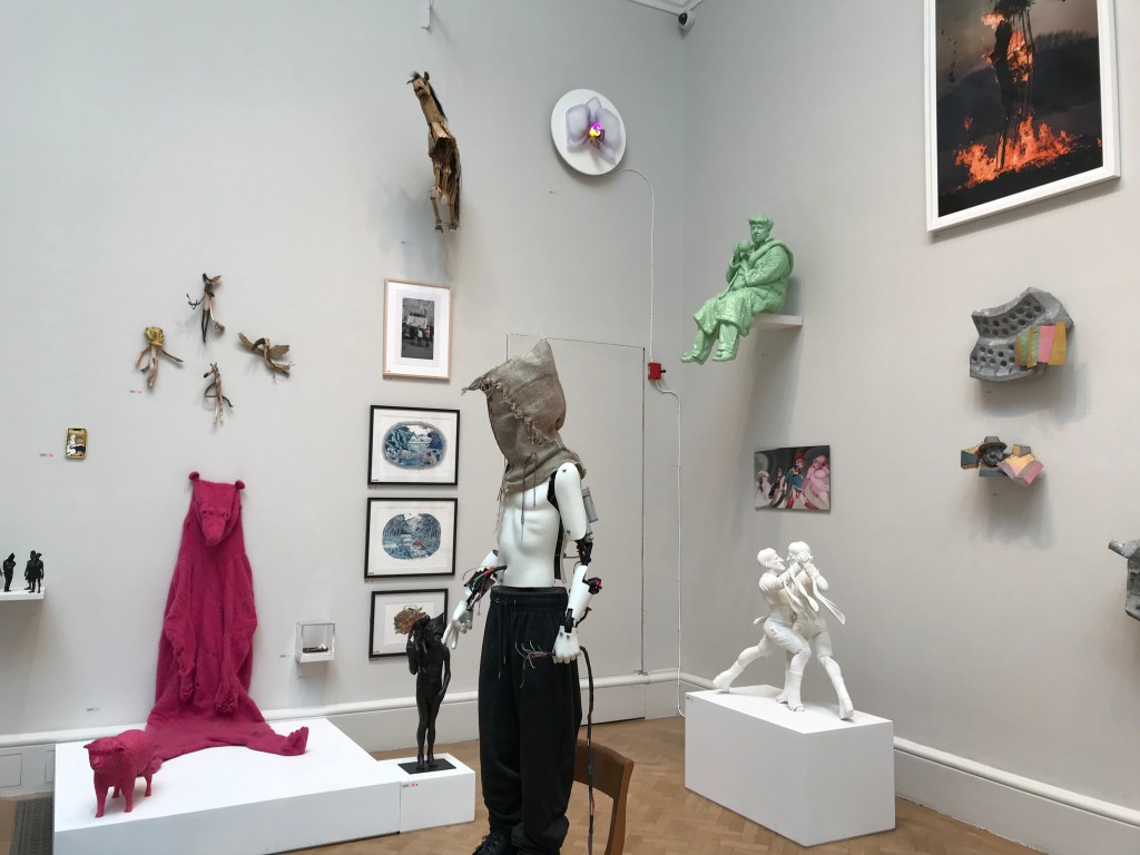
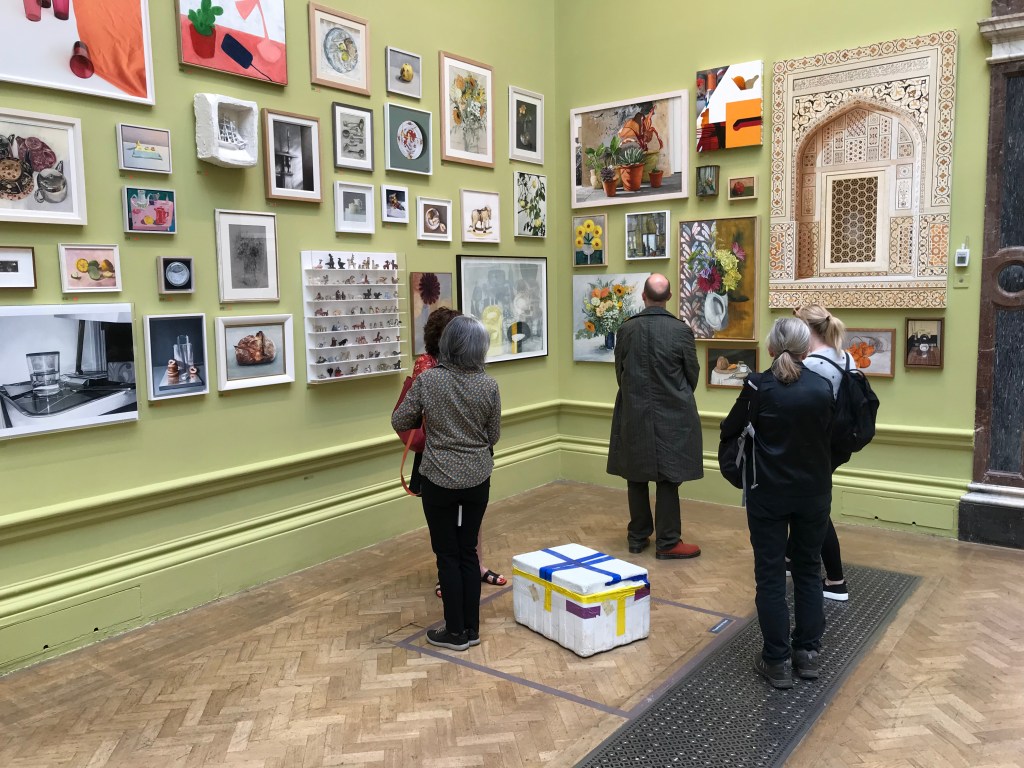
So, I decided to risk it and check out this year’s show to see if there had been any shifts in approach. The Summer Exhibition is the largest and oldest open submission show of contemporary art in the world, so thinking positively I hoped a change could be on the cards. I was happy to find a show with a greater diversity of artwork made in a variety styles and mediums. This year’s show was coordinated by artist David Remfry RA and is thematically based around the title ‘Only Connect’. It is more eclectic and the displays are less packed to the brim than in past editions. The galleries are thoughtfully arranged by different artist coordinators and each gallery has had its walls painted in a different colour to set a background tone for each space. One of the many highlights are the artworks selected by Tim Shaw RA in the second half of the show. The display is pretty wild and includes everything from a kinetic mannequin sculpture, a warped portrait of Donald Trump to a pink polar bear suit. The show offers the opportunity to check out some of the current trends and to see what artists are making and what is selling. I enjoyed finding that there is room for work exploring urban decay and social criticism. Washy paintings with fluorescent underpainting are also trending.
It is an exciting improvement to past editions but I found that the Summer Exhibition still falls short of showcasing contemporary art well enough. The show continues to group many of the artworks together by conventional categories and then segregates these from new forms of contemporary art. This approach creates a disconnect in the flow of the exhibition and display of works. Conceptual art was hit the hardest and I think it was a brave decision for any conceptual artist to include their work in the show. ‘Veg Box’ by Gavin Turk and ‘Rest in Pieces, or The Squatters (Charlie Meet Hammons Untitled (Night Train (1989)) by Ryan Gander are conceptual, sculptural works which imitate everyday objects. Gavin Turk’s work is a bronze sculpture of an ordinary polystyrene box and Ryan Gander’s piece is a sculpture of a dead or sleeping cat. They stood out like sore thumbs against the walls of still life painting in the gallery and they were largely ignored by visitors.
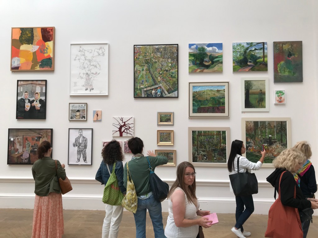
Wohl Central Hall gallery installation including a group of landscape paintings
Another clash appeared in the Wohl Central Hall which included a grouping of representational landscape paintings. They are very nice works but, like an exclusive club for landscape painters, they look set apart from the rest of the works on the wall. This highlights the conventions of the Summer Exhibition and how sticking to its traditions weakens the case for innovation and progression in contemporary art. The Summer Exhibition is after all the product of an institution steeped in tradition and convention. It’s nothing ground breaking but it is enjoyable and it does feel like a step in the right direction in reflecting the diversity of contemporary art practice. I’m hoping they continue and go further for the next editions.
Could you tell us a bit about yourself art and your background? Where did you study?
I grew up in Teesside in the northeast of England and studied my Foundation at The Northern School of Art. I then moved to Manchester in 2015 to study BA Fine Art at Manchester School of Art (Manchester Metropolitan University). This is where I discovered that I wanted to be an artist. After I graduated, I stayed in Manchester for a couple of years and continued to develop my practice – I had a studio at Paradise Works, which is a fantastic studio group in Salford. In 2021, I decided to leave the North and began studying my Masters in Painting at the Royal College of Art (after receiving the Basil H. Alkazzi scholarship award) – I’m now in my second year.
In your paintings, you use a wide variety of references from general culture and art history. How do you select the starting points for your work?
My paintings explore the collective experience of women and my relationship with other people/ myself – therefore I get ideas all the time by just existing. Ideas for paintings come when I’m least expecting them, normally when I’m relaxed. I keep a notebook with me and sketch out ideas as they come. If I’ve forgotten my notebook, I draw them in the notes on my phone. These preliminary drawings are basic and are often just stick figures with some writing next to them to tell me what the drawing is actually meant to be. It’s later when I begin to build on the narrative and the concept of the painting. This is when I add references to art history, and culture, and use various motifs and symbols to translate the intended story.
Can you tell us a bit about your process and how your paintings evolve and take shape?
Once I have an idea for a painting, I create a digital collage in photoshop using primary and secondary photographs. The painting begins to change a lot at this point. I try not to be too precious about my digital collages, so I continue to sketch into them and write on top of them – sometimes writing the name of the motif, for example ‘pigeon’, instead of spending time drawing a pigeon. Once I am happy with a collage, I scale it up onto canvas/linen/panel. The composition always looks very different when it’s scaled up and off my computer screen. So, I start to add, remove, and rearrange the composition and begin to think about colour and texture. This is my favourite part of the process as the paintings start to feel alive.
The title to your latest show; “At Least Buy Me Dinner First” suggests an ironic humour. How has humour and comedy influenced your approach to painting and visual arts?
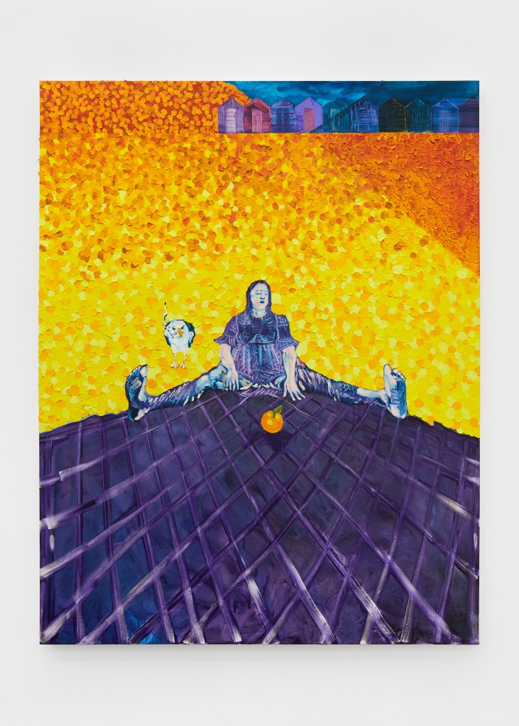
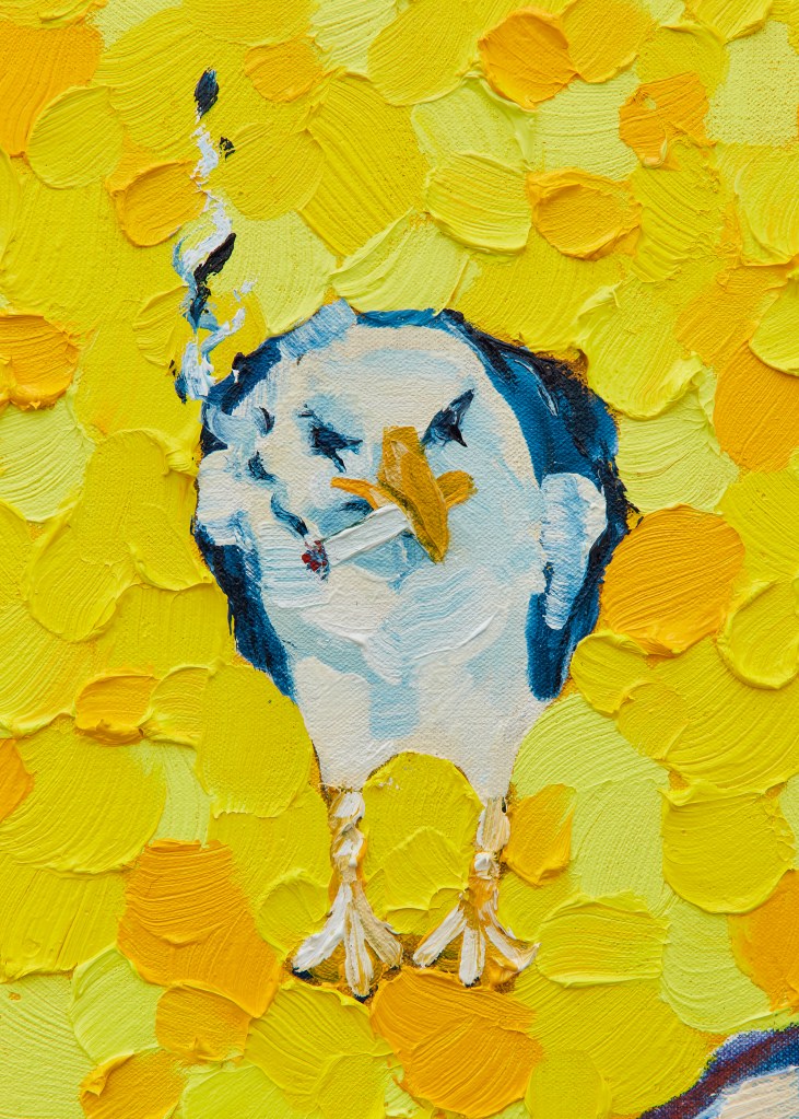
I love being silly and laughing, so it was inevitable that a bit of humour would find its way into my paintings. A lot of my paintings deal with quite difficult themes and often explore the darker sides of life and relationships. The works are deeply personal and so, consequently, I often feel quite vulnerable and exposed during the making. Adding humour or playful motifs (like the smoking seagull, creepy sea-creature legs, and worms on the BBQ) lightens the process for me. I need that silliness.
I wrote my dissertation about Brecht, and how contemporary painting could adopt Brechtian strategy to make it a more useful tool for social change/comment. Brecht used comedy within his plays as he recognised it as a tool for political comment. He used comedy to make the familiar strange and I recognised that some of my favourite artists (e.g. Dana Schutz and Nicole Eisenman) do just that. Their humour and playful surrealness give the work an immediate access point. I like to play with that access point – I want my paintings to have two tempos. Firstly, the immediate tempo (achieved through humour or vivid colour) – that’s what draws you in. Secondly, the quiet tempo that creeps up on you (achieved through ambivalence, symbolism, unusual narratives and distorted compositions) – this is what makes the audience re-look at the painting and discover something new. Like Brecht, I want this duality to stimulate conscious critical observation.
This same duality led me to use this title. As you say, it’s ironic and humorous but also really sad. You know exactly who is saying it, how she’s said it, and who she’s said it to. It’s vulnerable, it speaks about power imbalances and unfair exchange, but it’s also light.
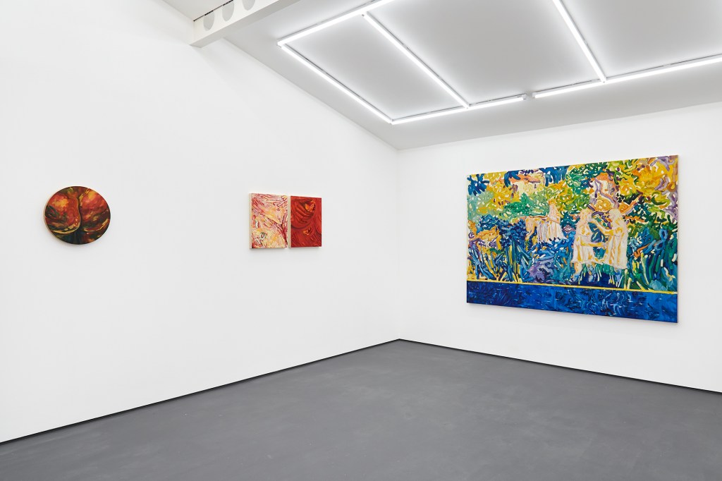
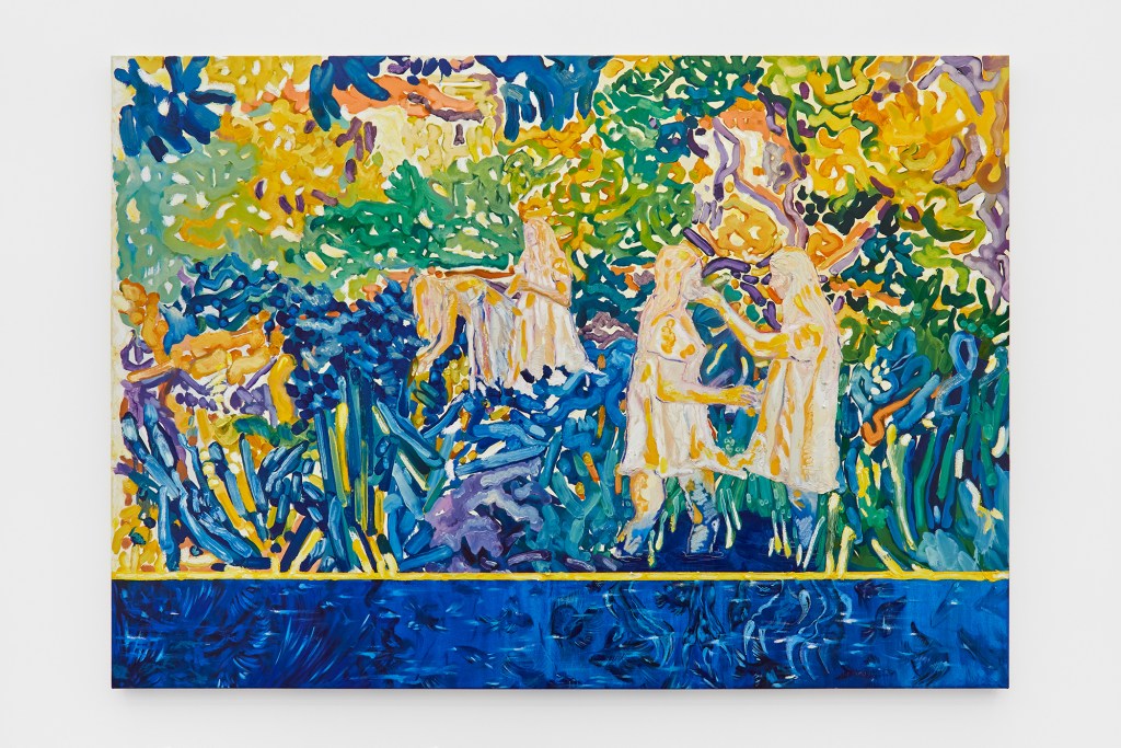
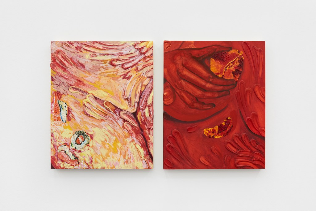
‘At Least Buy Me Dinner First’, installation view.
A number of your paintings often depict personal experiences, observations and memories based on your own life experiences. Have you found this to be a reflective and cathartic process? And has this meant that you have ever reappraised your thoughts of your experiences?
The paintings respond to the collective experiences of women and are influenced by my own experiences and stories shared with me by others. They don’t represent direct situations, for example ‘will you still love me when I’m not young and beautiful?’ doesn’t represent me foraging in the landscape and swimming with friends, but instead it speaks about love and obsession, ineffable femininity, and societal pressures.
My process is certainly reflective and cathartic, and the experience of painting always helps me process things.
There is a tension in the work which has been set up by the picture’s bright colours, energetic brush strokes and complex subject matter. Is this an experience you would like a view to be aware of?
Like humour, I also use colour to achieve the immediate tempo I referred to. Lubaina Himid said in a Talk Art interview that she likes to use colour to draw the viewer in. Once she has them hooked and looking at the paintings, she can reveal the darker political messages of the piece. I loved the way she articulated this, as though she was manipulating the viewer. Like Lubaina, I’m using colour like a tool. I don’t care if my viewer is aware of where the tension is coming from, I just care that the tension exists.
Your work includes painting, sculpture and ceramic. How do you find the relationship between working in both mediums? Are there any connections in the process and approach?
I’ve always painted – but I only became interested in ceramics when I was studying at Manchester School of Art after being inspired by the work of Lindsey Mendick. Funnily enough, Lindsey is Guy’s partner – the brilliant artist who also has a solo exhibition opening at Brooke Benington on the same evening as mine. In 2020, after securing a DYCP arts council grant, I was mentored by Lindsey. It was during this time that I realised it wasn’t the material that interested me most about Lindsey’s work, but it was her ability to communicate. She is brutally honest, confessional and dramatic. Lindsey supported me during a very formative time. It was during this period that I learnt how I could explore personal experiences, and raise social and political injustices through my work, within a boundary I was comfortable with.
For the last two years I’ve been consumed by painting (with only the occasional dip into ceramics when using it to explore paint). I love ceramic because of its texture, so recently, I’ve been playing with paint more and exploring how I can get more sculptural texture into my paintings. It’s been a really fun process and I’ll forever be a massive paint geek.
My focus for the new year is to work towards my Degree Show (June 2023) and complete my Masters in Painting. The facilities and technicians at the Royal College of Art are fantastic, so I want to make sure I’ve dabbled in every workshop before I leave. I’ve really enjoyed painting on wooden panel recently, and many of the works in ‘At Least Buy Me Dinner First’, are on circular wooden panels. I’m planning on developing my painting on wood and exploring surface a lot more in the coming weeks. I’m also in the early stages of working towards a couple of shows, which I’ll announce when I can on my Instagram – @kt_tomlinson.
Katie is presenting a new exhibition of work at Brooke Benington.
‘At Least Buy Me Dinner First’ will run from the 24th of November 2022 to the 14th of January 2023
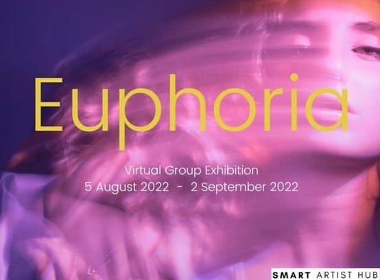
Euphoria brings together a group of contemporary artists to explore the theme of happiness and the complex blend of emotions that exist alongside it. The artists in the show present artworks which reflect personal responses to the theme and explore how euphoria can be found and experienced in a variety of ways including in the joy of movement, the love of the natural world, the brilliance of colour and the creative process itself. The artists present a striking selection of artworks which have been created using a wide variety of techniques.
The range of responses also reflects the complexity of the theme and how euphoria can be intrinsically linked with sadness and the rest of the emotional spectrum. They show us how euphoria can be such an intense sensation that it may easily swing over into a crazed, manic or over-excited state. Euphoria showcases artworks which reflect the inner voices of the artists, who like so many of us, have experienced the emotional challenges of the global pandemic.
This has given each artist time to reflect and consider exactly what is happiness.
What does happiness look like? And what does it mean to them?
In the show, Cristian Diez-Sanchez presents a series of sculptures which explore the emotional relationship between the human form and its environment. Elisa Velasquez creates sublime, abstracted landscapes with fields of bright, vibrant colours, textures and brushstrokes. In her work, artist Julie Waas, expands joyful organic and geometric forms with interweaving lines, dots, stripes, circles, triangles, leaves, zig-zag’s and undulating lines. Manuel Salazar’s paintings of energetic, swirling forms generate multiple perceptions. Mónica Acedo explores a love of the natural world and nostalgia in her paintings.
It was a pleasure to support Smart Artist Hub with this brilliant, brand new show.
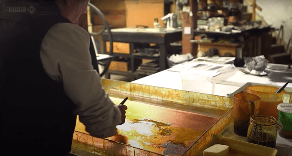
“Don’t drink and etch”, Norman warns us. Maybe that’s because driving, like etching requires attention and concentration at each step of the process. Norman changes his approach at each stage according to what the process requires. He’s lose, focussed, instinctive, methodical. While watching him we can see that he is working things out in his mind and that he is two or three steps ahead in the process. Norman is restless. Always moving, thinking, fidgeting and playing. The creative energy comes out in his work. He paints resin on the copper plate with loose, gestural brush strokes. I love the way he approaches such a technical process with great fluidity, confidence and looseness. He captures his experience of nature. Norman says he can translate this experience by; “squeezing essence out of it and put it down in a very elegant, simple way’.
In this new series of posts, we’ll explore the histories of key leading contemporary artists and the starting points of their creative practises.
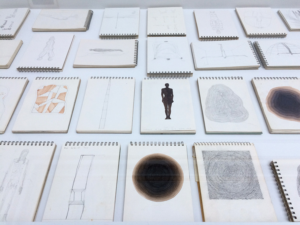
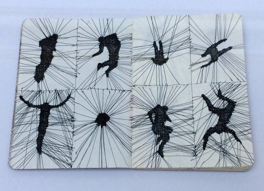
Artist Antony Gormley RA is best known for his large scale sculptural works but he also produces a vast amount of drawings and sketchbooks as part of his practise. Antony is a prolific drawer and he has been producing works on paper for more than four decades. The sketchbooks are a window into Antony’s mind and working process. They include sketches, statements, detailed diagrams, doodles, working out’s, patterns and experiments. They record the variety of approaches used to explore each idea or concept which may include contorted and modified bodies, groups and lists of figures in different poses. Many of the drawings explore the figure in space but they also depict architectural and organic forms. These also include sketches of famous artworks such as the Angel of the North.
In this sketch we can see how Antony explores different forces acting on the body. He has entangled the figure in a kind of linear matrix which pushes and pulls the body into different positions.
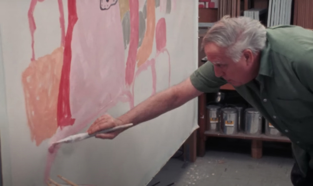
Philip Guston is an older man in this video. He’s alone in a museum and then working in his studio. His demeanour is calm and focused. He concentrates on painting a horizontal line with pink paint at the bottom of a large un-stretched canvas. The painting is hard to read but it has one of Philip’s trademark hooded figures in it and a number of round forms. It’s hard to see where the work will go but Philip’s approach is deliberate. He has an artistic vision and he works between abstraction and figuration. In his swinging America accent he tells us that; “The appearance may change, that’s why the comments about style sound strange to me, you know, you work in this style or that style as if you had a choice in the matter. What you’re doing is trying to stay alive and continue, not die. Therefore, it’s circular….”
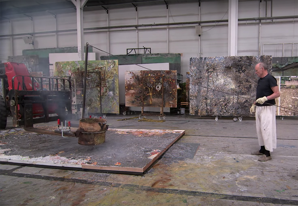
We watch Anselm in his enormous, ex-warehouse studio space working on some large-scale works. It’s exciting to see artwork being made on this scale. He’s like an architect gone berserk! Anselm approaches the scale and the industrial techniques so freely. He’s pretty chilled. It seems like he’s just loosely painting a new picture. He casually whistles while he and his team of workers (assistants) pour molten lead from a bucket attached to a crane truck onto a canvas on the floor. But he’s definitely in charge. He directs the driver with a vigorously waving hand. It looks like such a precarious and haphazard technique. What is this guy’s vision? Is he serious or is he nuts? It’s impressive to see industrial and organic materials used in art and work made at this scale but it could also be seen as wasteful. Anselm was ranked as one of the richest people in Germany in 2017. As an established contemporary artist, Anselm has the financial means to make such large-scale work. He’s going after the Gesamtkunstwerk/ total artwork but at what cost?